The age of customization: iOS14 and its widgets
Apple’s newest software update allows iPhone users to be more flexible with their app organization than ever before
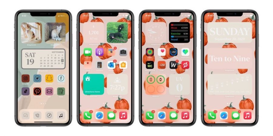
The ability to personalize home screens and iPhone interfaces has led to a trend following the release of iOS14. Graphic by TechnoSports
October 25, 2020
The release of the newest Apple software update, iOS14, on Sept. 16 introduced a wave of several new features for users with the iPhone 6s and newer models. The update includes changes on FaceTime, iMessages, Memojis and many other pre existing features. But what caught the attention of many users was the ability to customize iPhone home screens using the widgets feature and the Shortcuts app to create new icons covers for their apps.
These features have primarily been customized for convenience or aesthetics, and many students have utilized the customization abilities to create themes. Junior Arshiya Chaudhary was introduced to this aspect of the update on social media, which inspired her to spend time on her own home screen design.
“I saw it on TikTok first and it just looked cool,” Chaudhary said. “It seemed like a really fun way to personalize your phone, not only on the outside, with [phone cases] and stuff, but also [with] the software itself.”
Chaudhary tailored her widgets and home screen to follow a ‘Dark Academia’ theme. She claims that she has become almost obsessed with the aesthetic after reading the book “Secret History” by Donna Tartt, and attributes “a lot of ancient England private school vibes” to her layout.
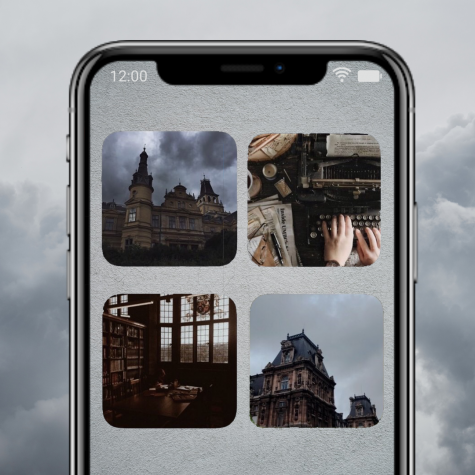
The entire process took her around forty minutes because Chaudhary felt indecisive about what would look best. Now, she says that even though she feels like she has gotten bored of looking at her current set-up, she probably won’t change it due to how much time it took her. In contrast, junior Shruti Sharma, who spent four hours on her layout, foresees herself changing her setup after she gets sick of staring at the same design.
“It took me a good half an hour just to figure out how to do everything, how to change stuff,” Sharma said. “But the first thing that I did was experiment with the different widgets, and then I organized all the apps that I wanted. The last thing I did was change the colors of all of the [apps] and find a wallpaper that I felt matched it.”
Like Chaudhary, Sharma drew design inspiration from examples she had seen on TikTok. She explains that her final customization resembles a “cross between Minecraft and Slytherin,” but that wasn’t her initial intention. Initially, Sharma based her home screens mostly on colors she felt connected to, and put a lot of thought into her arrangement’s color theory.
“Right now, I’m feeling like the color green,” Sharma said. “So I know I wanted it to have green and then I didn’t want it all to be green, so brown was the color that matched it..”
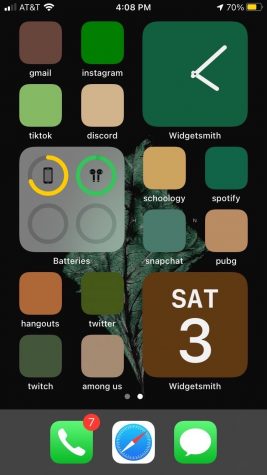
Currently, Sharma’s widgets include a clock, a calendar and the battery levels of her AirPods and phone, which she was able to implement using a third party app called Widgetsmith. She opted to display important information that she felt she needed to see on a daily basis, while for Chaudhary, many widgets were pictures that contributed to her theme.
Senior Jahnavi Naik’s customization process holds a similarity to Sharma’s because she structured her screens around what felt most convenient. Naik’s widgets include her reminders, battery level, calendar and weather.
“I just thought [iOS14] would be easier to have because, before, [my screen] was really cluttered,” Naik said. “ I used my reminders app a lot so I thought it would be best if I could just have that on my front screen so I could always see what I had to get done. I use that as a to-do list and it was just super easy having it right in the front.”
Another aspect Naik finds convenient is the App Library feature that was released as a part of iOS14. The App Library allows users to keep apps that they don’t use as often off of their home page and in a separate folder, avoiding a busy screen. However, she also states that there’s an “organized chaos” to her setup so she believes she still has more customizing to do.
“I think my apps are still a little cluttered – I have a lot [of apps] that I use,” Naik said. “I want to find a way where [navigating my phone] would be more convenient because there’s a lot going on.”
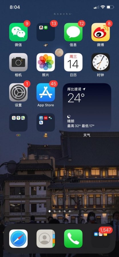
Naik and Chaudhary have avoided one aspect of the widgets and home screen customization feature: the ability to change the icons of apps. Naik attributes this to an effect that many have criticized, where clicking on an app with an edited icon first directs the user to the ‘Shortcuts’ app, causing an inconvenient delay after which the actual app opens.
Junior Soteria Li has also avoided changing her app icons, but for a different reason: she believes she wouldn’t be able to find her apps if their images were changed. In order to fit into Li’s phone theme of specific color themes for certain pages, the apps would have to be very different from their original icon. As of right now, she chooses to separate her apps by their existing colors and, which helps her navigate through her phone by color.
“I like colorful things, like everything with color,” Li said. “I just feel like color makes your life more vivid.”
While her current home screens only feature a few colors, Li envisions having a rainbow theme in the future if she gets the time to further customize her phone; her current customization process took her thirty to forty minutes. Li matched her background to better fit the colors she wanted, and like Chaudhary, also customized her widgets to fit her theme. Her phone features photo widgets to fit her color themes made with Widgetsmith, including a widget that displays battery level and the weather and a clock which she created with another third party app, Color Widget.
“At the beginning, I thought [using widgets] was just a new thing that I wanted to try out,” Li said. “So I searched up some tutorial videos, like how to organize [my screen] better because I was staring at my home screen for a long, long time but I [hadn’t] changed it so it was kind of boring to me.”
Even with the inspiration of videos and peers who have also tried out iOS14 customization, Li has been able to keep her photo widgets unique by only using photos she has taken. She believes it’s best to not use other people’s photos in her personal phone because they aren’t as special to her, and it helps that she already has an interest in photography.
“I think [the process was] worth it, because sometimes when you look at your homescreen, you get bored,” Li said. “And when you decorate it more, it just feels comfortable when you look at it, like you become more organized. When you organize with color themes, when you think, ‘I want to go to Instagram,’ then you know, ‘Oh it’s purple!’ and you can [go to the purple screen].”
While Li finds satisfaction in her created aesthetic and Naik finds it in the functionality of her new home screen system, both can agree that they’ve benefited from putting in the effort of updating their phones to iOS14 and utilizing its unique new features.
“I recommend people take the time to organize [their home screen] if they haven’t,” said Naik. “I know it’s a lot of work and you don’t have to go above and beyond with all the themes, but for me, it made a big difference.”


