Site Seeing
September 28, 2018
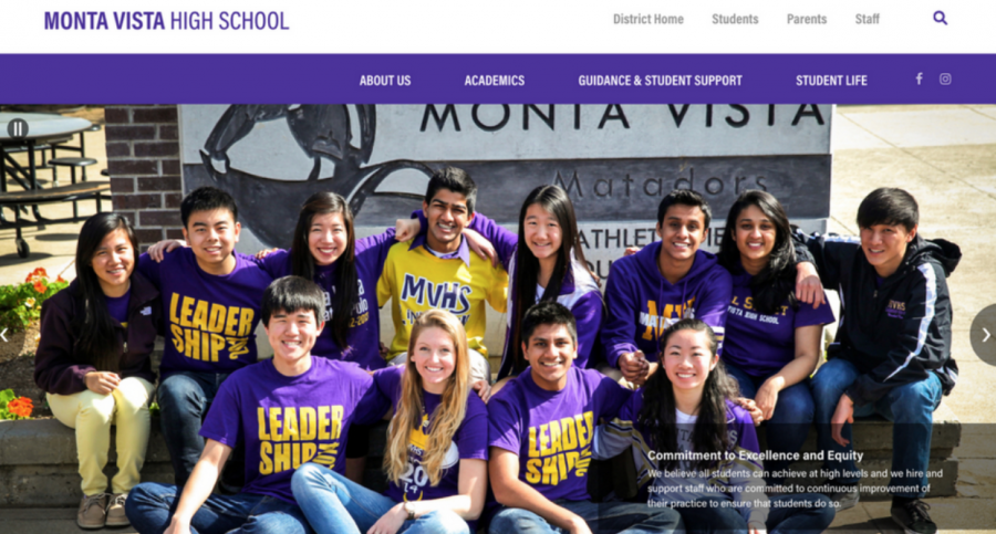
On Friday, September 7, the MVHS website was relaunched after over a decade. The proposal for the new website had been in in talks for two years prior to the formal relaunch, and went into action well over a year ago. The reasoning behind the redesign was simple — the FUHSD administration wanted a uniform layout throughout all the websites and wanted to convey the spirit of each school site within the district.
Math and Computer Science teacher Debbie Frazier has been MVHS’ webmaster for the past four years. She annually updates the staff list and on-campus news, such as auditions for plays and the daily bulletin. Not only does she handle the backend of the website, but she also offers her assistance around campus to staff who maintain their personal websites for class. For example, she will provide the school domain information and educate them on how to develop their websites. Frazier hopes that the new MVHS website will be a place where everyone can easily access information.
“[The website is] really public facing so we really want to help the public, the community, be able to talk with the school and not create a barrier for them,” Frazier said. “We worked on reorganizing how things are laid out and we decided there are really three roles, when you went to the site.”
Visitors of the site tend to be students, parents or staff. Now, each visitor group has its own portal on the website. For students, their portal provides them access to School Loop, Infinite Campus, Naviance, Google Docs, Odysseyware and Destiny. For parents, their portal leads them to School Loop, Infinite Campus, FUHSD Foundation and Naviance. For staff, their portal includes School Loop, Infinite Campus, Outlook Email, AESOP, Destiny, Naviance and Google Docs. Each group also has the news tailored to their interests. For example, the staff portal will include events such as the monthly Pay Day Barbecue.
Another reason for the relaunch was to update its antiquated style, which did not fit the technologically advanced nature of Silicon Valley, according to FUHSD. The district decided to modernize and maintain a professional image on their media platforms. To enforce this change, the district came together to establish design and layout elements of all the websites in the district.
“Most of the things I think we talked about were adopting the same philosophy about what’s okay to post and how to post it,” Frazier said. “So [we talked about] design elements like limited fonts, color schemes, no clip art, no animated gifs, that kind of stuff.”
Not only has the main MVHS website undergone change, but the MVHS library page has also been reconstructed. Library media teacher Laura Utile claims that the original library page has been outdated and disorganized with overflowing text.
“There was a lot of words and different pages that you had to go to, so we were trying to make it so the front page is easy to see as soon as you land on the library page,” Utile said.
Utile also wanted to find a balance between what students needed and what students preferred. For information students need, such as research tools and library hours, she has these posted on the main page. The majority of the books provided at the library are a compilation of requests from students. Utile collects resources that students wish the library to provide and puts the requests into action. For the students who want to stay up to date on new books the library offers, they can now go on the library page and refer to the updated catalog.
“It’s basically what we think students need so we want to make sure we have fiction books and things coming in for your down time and your pleasure reading,” Utile said. “But we also want to make sure that we have the resources for all the academic work that you need to do so we try to have a balance of both.”
Though the new change may take a while to adjust to for some, the overall reception of the website has been positive. Senior Mehreen Manikkoth’s was excited when she first visited the new MVHS website as it was much more visually appealing than before.
“I like that the new website includes news and calendar updates on the front page, it makes it easy to see what’s going on and what events are coming up without having to go through the hassle of finding the calendar page like before,” Manikkoth said. “[However], I would like it more if I knew how to use the new website, [because] at the moment I’m just very confused.”
Manikkoth looks forward to using the new interface but is currently confused on how to navigate the new website. However, as people gradually adapt to the new website, it may become easier to access and use than before.


