


Apparently, “Les Misérables” predicted the color of the year in the song “Red and Black“, a song that introduces a group of young student revolutionaries in the June rebellion on Paris in the early 18th-century. At least, it predicted the color much better than the Pantone Color Institute, a company that is a manufacturer of colored paint and other materials, most well known for their choices for color of the year.
Sadly, not everyone seems to be as realistic as I am at looking towards the future. The Pantone Color Institute released the 2017 color of the year last month.

Apparently the zesty young shade is meant for “consumers to take a deep breath, oxygenate and reinvigorate.” The color is all about “flourishing foliage and the lushness of the great outdoors,” and encourages people to submerge themselves in nature as a way of renewing themselves.
What nonsense.
Because as I look to the future of the nation with a symbolic color, I think I’d need more than just green to describe it. The fear of not knowing. The instability of what is to happen. The masses of people and their discontent with the future of our nation. I don’t think that can be simply summed up by “greenery.”
The reason Pantone chooses a color of the year is for it to reflect the attitude and mood of the world. This color then appears throughout the year’s home decor, fashion and wherever else it’s applicable. However, I don’t think Pantone has been doing a very good job recently. Guess what 2016’s colors of the year were:
Rose Quartz and Serenity.
Two tranquil, embracing colors. Because that’s obviously what comes to mind when you think of 2016 — Pastel.
Everyone anticipates the wave of chaos that is about to crash in 2017 and the frenzy it’ll cause, so in my eyes, the color of the year is a simple choice:
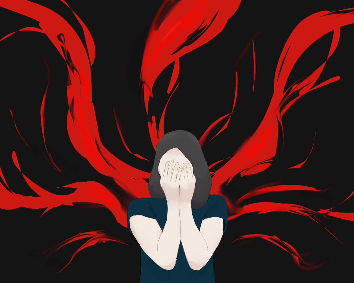
Red.

Because green doesn’t symbolize new beginnings. Green is the color of the grass you step on. The color of the kale you feed to your dog underneath the table. The color of nature. But right now, we don’t need nature.

We need the power of the people. It’s not green that evokes emotion and prosperity. It’s not green that warns us of the danger approaching ahead. It’s not green that courses through our veins and makes our very being possible. It’s red.

Red is dynamic; it overwhelms you. It’s meant to make your heart beat faster and your blood boil. But most of all, red means importance. Red is the color we paint onto our protest and picket signs. Red is the color that attracts attention to what those signs say. Red is the color that empowers us and makes us a force to be reckoned with.
Green’s neutrality isn’t what we need right now. We need strength, not passivity. We need people to stand up and fight — for themselves and for others. We need a color that’ll provoke us to do that, but I don’t think that color is going to be Pantone’s choice of greenery as “a fresh and zesty yellow-green shade that evokes the first days of spring.”
Maybe green is the start of new life. A restoration of the world. A sense of renewal. And yes, maybe that’s what we really need. There’s no doubt that nature and neutrality keep us happy in the moment and more in tune with our inner selves. And after last year and with all the upcoming tortures of 2017, taking a deep breath in the fresh greenery of the world doesn’t sound all that bad. So if you want, go ahead and revel in all your shades of greenery. Paint your nails, your walls, your posters and your picket signs in Pantone’s 2017 color of the year.
As for me, I’ll be here, waving my red sign with the rest of the people.