 Art gallery in Vallco Shopping Mall displays works of talented FUHSD students
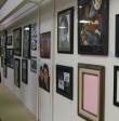
Colors run down a gallery in the middle of Vallco Shopping Mall. The entrance is practically a small hole in the wall, but stepping into the gallery reveals a large oblong area full chock-full of art, marked by a simple sign. A four-foot tall papier-mache penguin donning sunglasses and holding an ice-cream cone beckons visitors in.
Framed portraits line the walls while ceramics and other mixed media are displayed on tables in the middle of the room. White paint dots the ground and hints of pink peek out from the corners of the ceiling. The rooms were once a bright rosy color and FUHSD art teachers had repainted the place white several weeks before the gallery opened on March 8. What is left of the original pink color is a framed rectangular patch that is part of the exhibition.

Spectators walk along, ignoring the paint on the ground, admiring the art around them.
"Well, [this artist] is going to design video games when he grows up."
"I love this! This is fantastic!" a spectator had said of a model made entirely of Legos.
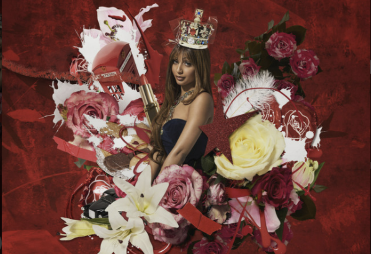
Some works are self-portraits, others are abstract. Many are somewhere in the middle — an abstract self portrait. All of them are just an glimpse into the artists' mind. There are atypical mediums, such as MVHS senior Katherine Frazer's packaging tape mold of human heads, Cupertino High senior Mélanie Daguin's copper wire tree and MVHS senior Angela Lin's design cut out from coffee spilled paper, along with the usual acrylic, ceramic and photography.
A tree made of copper wire stands in a clear plastic box, surrounded by books made out of clay and other materials. Outside the back room where graphic design work is exhibited is a five-foot tall giraffe. Not everything is that big though. There is a small giraffe carefully built from toothpicks on the table right in front of the huge giraffe.
Also, Fremont High's Alex Siegle's three panels of cut paper seems like repeating designs at first glance. Further inspection reveals a subtle change in design for each square so that the each panel seems like a whole, yet separate at the same time.
In the end the colors all run together, and though we may not be able to see the colors of the wind, we are able to have a glimpse of the creativeness of high school artists.


