By Gauri Kaushik
At the beginning of every year, the Pantone Color Institute chooses the Color of the Year, a specific shade that symbolizes the upcoming year. Lauding itself as the “global authority on color,” the institute’s chosen color for 2018 was Ultra Violet.
According to Pantone’s website, PANTONE 18-3838 Ultra Violet is “a dramatically provocative and thoughtful purple shade,” that “communicates originality, ingenuity, and visionary thinking that points us toward the future.” Leatrice Eiseman, the Executive Director of the Pantone Color Institute, says that the bluish purple hue “takes our awareness and potential to a higher level [... and] lights the way to what is yet to come.”
To most, a single color doesn’t hold much meaning. But for artists like junior Alisha Gao and sophomore Anahita Sukhja, color gives them the opportunity to shape the way their artwork is perceived. Gao, for example, likes to use color to make her work more dimensional and interesting.
“For art, I would say [that] colors are important because they give another dimension to work that might otherwise not have any depth if it’s [only] black and white,” Gao said.
Unlike Gao, senior Arjun Mathur likes the effect that a black and white color scheme brings to his photographs.
“If I like the contrast in a picture, I’ll just make it black and white,” Mathur said. “It can kind of emphasizes the contrast.”
Although Gao usually uses the colors that happen to be next to her when she draws, she believes that color is important to how someone feels when they look at her drawings.
“If you use a lot of blue, for example, then it would seem more sad than if you had the same image but with warm tints or tones,” Gao said.
Sukhja, who has been drawing since she was in 6th grade, says that colors not only make her drawings more interesting to look at, but also allow her to emphasize certain aspects of a painting and to communicate with a viewer.
“Colors just make you feel a certain way,” Sukhja said.
Although Mathur doesn’t pay attention to color when he’s shooting his photographs, when he edits them later, he often plays around with color.
“If the subject is wearing like an interesting color, I’ll try to highlight that color when I edit [the picture],” Mathur said.
Like Mathur, Sukhja also uses different colors to draw attention to specific parts of her art work.
“If you wanna emphasize something else, you’d use a different tone or a different color,” Sukhja said. “[It] show[s] that okay this is all sad but this is this one point of happiness that you should focus on when you look at the painting.”
In addition to allowing artists to emphasize specific aspects of their work, colors can also reflect how the artist was feeling when they created the piece. Although Gao is usually calm when she draws her emotions on a certain day sometimes dictate what colors she decides to use in her artwork since she draws in order to destress.
“If I’m sad I stray away from blue because that would make me more sad,” Gao said. “If I’m sad I wouldn’t really want to add more blue because it just looks like my day, so I would rather try something else.”
Sukhja, on the other hand, doesn’t believe her emotions affect which colors she uses, although it may affect the quality of her art. She uses either cooler tones or warmer tones in her art in order to communicate with the viewer.
“[Color] is to make you feel a certain way,” Sukhja said. “The artist is supposed to make the painting make you feel a certain way and see what the artist was trying to depict why they did that painting or drawing.”
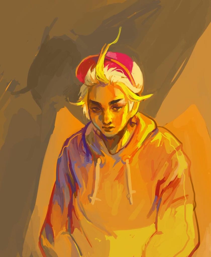
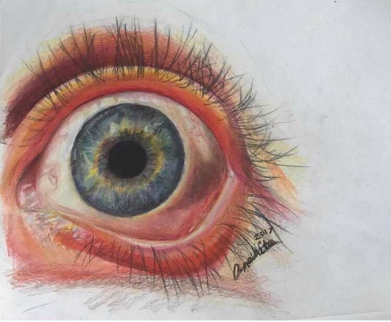
Although Gao likes to experiment with colors, sometimes the colors she uses do convey a deeper meaning. She uses warmer or cooler tones to depict certain emotions. Hover over the picture below to read about Gao's use of colors in one of her pieces.